Desktop vs. Mobile Rankings: Why They Differ and How to Track Both
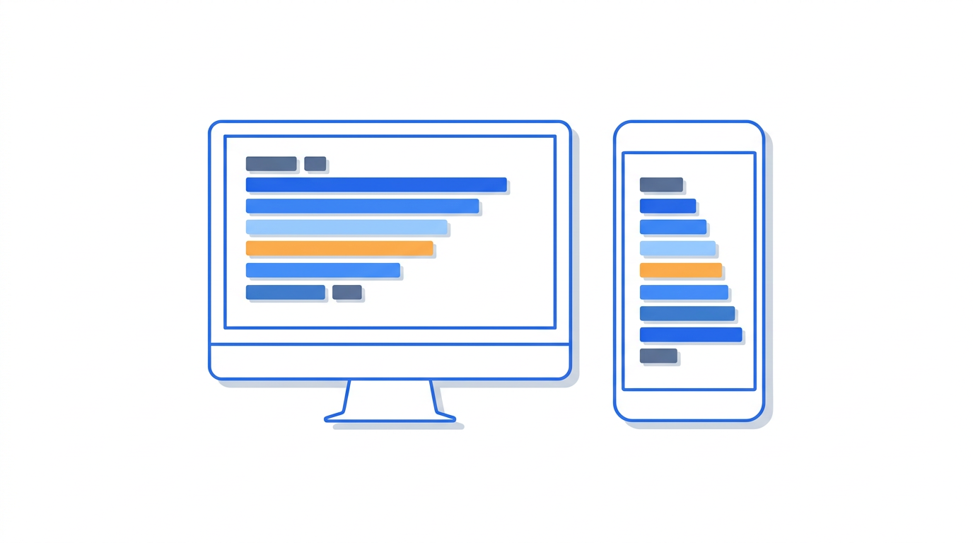
The gap between desktop and mobile rankings is no longer a minor discrepancy; it is a fundamental characteristic of the modern search ecosystem. Since Google completed its shift to mobile-first indexing, the mobile version of your website serves as the primary basis for how Google crawls, indexes, and ranks your content. However, this does not mean that desktop rankings have become a carbon copy of mobile performance. A website may sit comfortably at position two on a 27-inch monitor while languishing on page two of a smartphone’s search results.
Understanding the nuances of desktop vs mobile rankings is critical for any digital strategist. Variations occur due to a complex interplay of localized search intent, device-specific SERP features, technical parity issues, and page speed performance. If you are only monitoring one device type, you are effectively blind to 50% or more of your potential traffic. Relying solely on aggregate data hides the friction points that prevent users from converting on the devices they use most frequently.
In this comprehensive guide, we will analyze why these ranking differences exist, the technical factors that trigger device-specific volatility, and how to implement a robust mobile rank tracking strategy. By the end of this article, you will be equipped to diagnose ranking gaps and ensure your site maintains visibility regardless of the hardware your audience uses.
- Mobile-first indexing means Google uses the mobile crawler as the primary source, but rankings still diverge based on user context and device capabilities.
- SERP real estate is significantly more constrained on mobile, often pushing organic results below multiple layers of ads, local packs, and AI-generated snapshots.
- Technical "parity" is the leading cause of ranking gaps; content hidden behind "read more" buttons or different navigation structures on mobile can lead to lower relevance scores.
- Core Web Vitals often vary by device due to CPU and network throttling on mobile, directly impacting mobile-specific rankings.
- Effective monitoring requires segmenting Google Search Console data and using dedicated rank trackers to observe device-specific SERP features.
The Fundamentals: Mobile-First Indexing vs. Device Ranking Differences
A common misconception in the SEO industry is that "mobile-first indexing" means that desktop rankings no longer matter or that they are identical to mobile rankings. In reality, mobile-first indexing refers to the process by which Googlebot crawls the web. Google now uses its smartphone agent to evaluate the content, structure, and metadata of a page. This version becomes the "source of truth" for the index. If a piece of content exists on your desktop site but is missing from your mobile site, Google will likely ignore it for ranking purposes on both devices.
However, once the content is indexed, the actual ranking of that content is influenced by device-specific signals. Google’s algorithms are designed to provide the best user experience for the specific hardware in use. For example, if a user searches for "emergency plumber" on a mobile device, Google assumes a higher degree of urgency and local intent. The mobile SERP will prioritize the Local Pack and click-to-call buttons. On a desktop, the same query might yield more informational or directory-style results because the user is more likely to be in a research phase.
This creates a dual-track ranking environment. While the foundational index is mobile-centric, the presentation and ordering of results are context-dependent. This is why comparing rank tracking data vs. Search Console is vital; you need to see how the algorithm interprets your site's utility across different screen sizes and connection speeds.
Why Search Intent Shifts by Device
Search intent is not static. Users interact with their devices in different environments, leading to what we call "contextual intent." Mobile users are often "on the go," looking for quick answers, directions, or immediate transactions. Desktop users are often at work or home, engaging in deep research, long-form reading, or complex workflows. Google’s RankBrain and other AI systems recognize these patterns and adjust the SERP accordingly. If your content is optimized for long-form desktop consumption but fails to provide a quick answer for a mobile user, your mobile ranking may suffer even if the "content" is technically the same.
SERP Layout and Visual Real Estate
The most visible difference in desktop vs mobile rankings is the physical layout of the Search Engine Results Page (SERP). On a desktop, there is ample horizontal space. Google can display sidebars, Knowledge Panels to the right of organic results, and multiple columns of information. On mobile, everything is compressed into a single vertical column. This constraint forces Google to be more selective about what it shows "above the fold."
On mobile, the first organic result is often pushed down by:
- Top-of-page Ads: Mobile ads take up a larger percentage of the screen.
- AI Overviews (SGE): These generative responses can occupy the entire initial viewport on a smartphone.
- Local Packs: For queries with local intent, the map and three-pack take precedence.
- Visual Units: Popular Products, Short Videos, and Image Grids are more prevalent on mobile.
Consequently, holding "Position 1" on mobile might result in a significantly lower Click-Through Rate (CTR) than Position 1 on desktop if the mobile SERP is cluttered with these features. Understanding what share of voice means in SEO requires looking at the actual pixel height of your results on different devices, not just the numerical rank.
The "Above the Fold" Disparity
On a desktop, a user might see three organic results without scrolling. On a mobile device, they might see zero. This phenomenon is known as "zero-click" or "below-the-fold" suppression. When analyzing your rankings, you must account for the fact that a mobile rank of #3 is often visually equivalent to a desktop rank of #10 in terms of visibility. This necessitates a more aggressive approach to mobile optimization, focusing on Rich Snippets and Schema markup to capture as much visual real estate as possible.
Technical Causes of Ranking Gaps
When we see a significant divergence in rankings—such as a site being #2 on desktop and #14 on mobile—the cause is usually technical. Google’s mobile-first indexing means the mobile site is the baseline, but if the mobile site is significantly slower or less functional, it will be penalized specifically in mobile search results.
1. Content Parity Issues
Content parity is the most common technical culprit. Many legacy sites use "m." subdomains or responsive designs that hide certain elements on mobile to save space. If your H2 tags, internal links, or primary descriptive text are hidden behind "Read More" accordions or are completely removed in the mobile CSS, Google may not give that content full weight. While Google has stated they can index content in accordions, they have also indicated that content that is visible to users is often treated as more important.
2. Core Web Vitals and Performance
Performance is a major ranking factor that is device-dependent. A page that loads in 1.2 seconds on a high-speed fiber connection on a desktop might take 6 seconds to load on a 4G mobile connection with a mid-range processor. Google evaluates Core Web Vitals separately for mobile and desktop. If your mobile LCP (Largest Contentful Paint) is poor due to unoptimized images or heavy JavaScript, your mobile rankings will likely lag behind your desktop rankings.
3. Intrusive Interstitials
Google penalizes mobile sites that use intrusive pop-ups or interstitials that cover the main content. While these might be tolerated on desktop where they are easier to close, they are considered a major usability issue on mobile. If your mobile site is flagged for intrusive interstitials, your rankings will drop on mobile devices while remaining stable on desktop.
Comparing Device Performance: A Data-Driven Approach
To diagnose why your rankings differ, you need to conduct a side-by-side analysis. This involves pulling data from Google Search Console (GSC) and your rank tracking software to identify patterns. You should look for keywords where the position gap is greater than three places, as minor fluctuations are normal.
| Metric | Desktop Characteristics | Mobile Characteristics | Impact on Strategy |
|---|---|---|---|
| Average CTR | Generally higher for top 3 positions. | Lower for organic due to SERP features. | Focus on SERP features for mobile. |
| Session Duration | Longer; users engage with deep content. | Shorter; users want quick answers. | Optimize mobile UX for speed/clarity. |
| Bounce Rate | Lower; higher tolerance for load times. | Higher; sensitive to speed and layout. | Prioritize Core Web Vitals for mobile. |
| SERP Features | Knowledge Panels, Sidebars. | Local Packs, Image Packs, AI Overviews. | Use Schema for mobile-friendly snippets. |
When you identify a keyword with a high desktop rank but a low mobile rank, the first step is to check the mobile SERP manually. Is there a Local Pack you aren't in? Is the page loading slowly on a mobile emulator? Is the content being pushed down by an AI Overview? Knowing the "why" behind the gap allows you to adjust your keyword research and content strategy to target the specific device needs.
The Mobile Parity Audit: A Checklist
Ensuring that your mobile and desktop versions are nearly identical in terms of value is the cornerstone of modern SEO. Use the following checklist to perform a device parity audit. Discrepancies here are the most frequent reasons for device ranking differences.
- Metadata: Ensure titles and meta descriptions are identical on both versions. A shorter, "optimized" mobile title can sometimes lose the keyword density found in the desktop version.
- Structured Data: Schema markup must be present on both versions. Missing Schema on mobile can prevent you from appearing in mobile-rich results.
- Navigation: Is your main menu significantly reduced on mobile? If internal links to subpages are missing from the mobile hamburger menu, those subpages will lose internal link equity.
- Visual Content: Are images and videos served in mobile-friendly formats (WebP, MPEG-4) and properly sized for the viewport?
- Readability: Is the font size at least 16px? Are buttons large enough to be "tappable" without zooming?
If you discover that your mobile site is a "light" version of your desktop site, you are likely suffering from a self-inflicted ranking ceiling. As you work through your 2026 SEO audit checklist, device parity should be a top priority.
Mobile Rank Tracking: Why Daily Data Matters
Because the mobile SERP is so volatile, tracking your positions once a week is insufficient. Mobile search results change based on the user's physical location (down to the zip code) and the time of day. A robust rank tracking tool should provide daily updates for both desktop and mobile versions of your target keywords.
Tracking both allows you to see: 1. Algorithm Updates: Sometimes Google rolls out updates that affect mobile signals more than desktop signals (e.g., a speed update). 2. Competitor Shifts: A competitor might launch a mobile-first site redesign that causes them to leapfrog you on mobile devices while you remain ahead on desktop. 3. SERP Feature Changes: Google may introduce a new "Buying Guide" or "People Also Ask" unit on mobile for your primary keyword, which changes the click dynamics even if your numerical rank stays the same.
For those managing multiple clients or large-scale sites, this granularity is essential. Many vetted SEO agencies use this data to justify their strategy, showing that while overall traffic might be flat, mobile visibility is increasing, which is a leading indicator of future revenue growth.
Advanced Diagnostics: Identifying the "Why"
When you notice a discrepancy, use a systematic approach to diagnose the cause. Not all ranking drops are equal. Some are caused by your site, others by Google's changing preferences for that specific query.
| Scenario | Potential Cause | Diagnostic Tool | Recommended Fix |
|---|---|---|---|
| Desktop #3, Mobile #15 | Technical Parity or Speed | PageSpeed Insights / GSC | Improve mobile LCP; Check hidden content. |
| Desktop #5, Mobile #2 | Local/Hyper-local Intent | Local Rank Tracker | Optimize Google Business Profile. |
| Stable Rank, Lower Mobile CTR | SERP Crowding (Ads/AI) | Manual SERP Review | Target Featured Snippets or FAQ Schema. |
| Mobile Rank Drops After Update | UX/Core Web Vitals | GSC Experience Report | Fix CLS (Cumulative Layout Shift) issues. |
If you find yourself asking, "why did my Google rankings drop?" specifically on mobile, start with the "Mobile Usability" report in Google Search Console. It will highlight specific pages that fail Google's mobile-friendly test. Even one or two "clickable elements too close together" errors can be a signal of poor mobile UX that drags down rankings.
"The desktop version of a website is the 'luxury' experience, but the mobile version is the 'utility' experience. Google ranks the utility. If your mobile site doesn't get the user to the answer in two taps, the desktop rankings won't save you."
The Role of Content Strategy in Device Parity
It is not just about the code; it is about the content itself. Writing for mobile requires a different mindset. On a desktop, users can scan large blocks of text. On a mobile screen, that same block of text becomes a "wall of words" that discourages reading. This affects dwell time and bounce rates, which are indirect ranking signals.
To optimize content for both desktop and mobile rankings:
- Use Short Paragraphs: Keep paragraphs to 2-3 sentences.
- Incorporate Bullet Points: Lists are easier to scan on mobile devices.
- Front-load Important Information: Use the "inverted pyramid" style of journalism to ensure the most critical information is at the top.
- Optimize for Voice Search: Mobile users often use voice queries, which are longer and more conversational. Make sure your headers answer these long-tail questions.
Matching search intent means recognizing that a mobile user might be looking for a specific data point, whereas a desktop user wants the full context. Your content must satisfy both without compromising the mobile experience.
Tracking and Reporting for Stakeholders
When reporting SEO progress to clients or management, it is important to distinguish between the two device types. If you show a single "average position" metric, you are smoothing over critical data. A site could have an average position of 10, but that could be composed of a position 2 on desktop and a position 18 on mobile. The strategy for improving a position 18 (likely a technical or parity issue) is very different from maintaining a position 2.
We recommend creating separate reporting views for mobile and desktop. This allows you to demonstrate the ROI of mobile-specific optimizations, such as image compression or improved mobile navigation. If you are an agency, this level of detail helps justify SEO agency pricing by showing the technical depth of your monitoring. It moves the conversation from "why aren't we ranking?" to "we are winning on desktop, and here is our three-step plan to close the gap on mobile."
Setting Up Your Tracking Environment
To get started with proper tracking, follow the steps outlined in our guide on how to set up keyword tracking. Ensure that for every high-value keyword, you are tracking: 1. The desktop rank. 2. The mobile rank. 3. The presence of mobile-specific SERP features (like the Local Pack). 4. The rank in specific geographic locations if you are a local business.
Future Trends: The Convergence of AI and Mobile
Looking toward the end of 2026, the gap between desktop and mobile rankings will likely be influenced heavily by AI-driven search features. Google's AI Overviews and products like Perplexity are designed to be "answer engines." On mobile, these answers often replace the need for an organic click entirely. Therefore, your mobile strategy must evolve from simply "ranking" to "being the source for AI."
This involves optimizing for AI search optimization, which emphasizes structured data, clear entity relationships, and high-authority citations. As AI agents become the primary way users interact with mobile search, the traditional "blue link" ranking will become just one of many ways to capture mobile traffic.
Conclusion
Desktop vs mobile rankings are not two separate battles; they are two fronts of the same war. While Google’s mobile-first indexing has unified the way sites are crawled, the delivery of results remains highly fragmented based on the user's device. To succeed in 2026, you must move beyond aggregate data and embrace the complexity of device-specific SEO.
By focusing on technical parity, optimizing for mobile-specific SERP features, and using high-frequency rank tracking to monitor both versions of your site, you can identify and close the gaps that are costing you traffic. Don't let your desktop success mask your mobile failures. Treat each device as a unique environment with its own rules, its own intent, and its own opportunities for growth.
Frequently asked questions
Why is my mobile ranking lower than my desktop ranking?
The most common reasons for lower mobile rankings are slow page load speeds on mobile networks, lack of content parity (where mobile users see less content than desktop users), and poor mobile user experience (UX) signals like small fonts or intrusive pop-ups. Additionally, mobile SERPs are often more crowded with local results and ads, which can push organic rankings down.
Does Google use two different indexes for mobile and desktop?
No, Google has moved to a single index based on the mobile version of the web. This is known as mobile-first indexing. However, even though there is only one index, Google uses different ranking algorithms and signals to determine the order of results on different devices, leading to the ranking variations you see.
How can I check my mobile rankings for different locations?
Standard search results only show you what a user sees in your current location. To check mobile rankings in different cities or zip codes, you need a rank tracking tool that allows you to specify the device and the exact geo-coordinates for each keyword check. This is especially important for businesses that rely on the Local Pack.
Should I prioritize mobile SEO over desktop SEO?
For the vast majority of websites, yes. Since Google uses the mobile version of your site for indexing and ranking, a failure on mobile will eventually drag down your desktop rankings as well. However, you should check your specific traffic split in Google Analytics; if 80% of your conversions come from desktop (common in B2B SaaS), you must ensure your desktop experience remains top-tier.
Will hidden content on mobile affect my rankings?
Yes. If you hide content on mobile to save space (using `display:none` or by simply not including it in the mobile layout), Google will not give that content full weight in its index. While Google can index content inside accordions and tabs, the best practice for mobile-first indexing is to ensure that all critical, ranking-focused content is visible and easily accessible to mobile users.